You may have heard many times that an effective CTA is at the top of the list of things that needs to be perfected when designing content.
CTA refers to a call-to-action– which is a prompt for your audience to do something. In essence, in every marketing campaign you build, you should ensure that there is a clear call-to-action to conclude your content with, whether it be a landing page, a social media post, an email, popups, opt-in forms, etc.
The CTA could prompt the user to make a purchase, sign up for your newsletter, register for a workshop, and others. It’s highly unlikely that your audience will do what you want them to do without clearly asking them to do it.
In this post, we will cover the main elements of a CTA button to help you drive conversions.
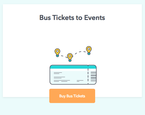
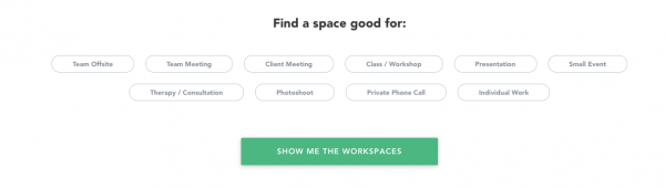
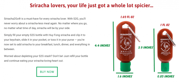
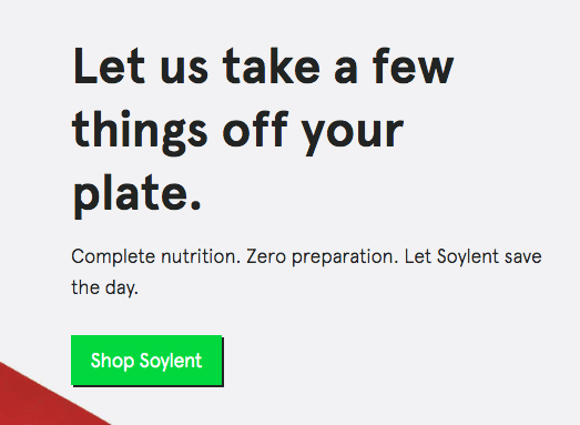
Make your CTA a button
The concept behind the CTA is not new and, in some cases, it is best to stick with the industry standard for marketing.
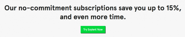
Simply put, people online are used to seeing buttons. We see a button, we press it. If a potential customer visits your site, likes your offering, and then sees a button, they will know what to do without much help.

Use a stand-out color
It may seem overly simple, but now that we’ve determined that your call-to-action must be a button, we also need to discuss what color this button should be.
The idea here is that it should be easy to find, and that means using a contrasting color. This is also an opportunity to flex your design skills, and use your brand’s colors in a creative way.
As it stands, green, orange, and blue buttons prevail as dominant button colors. Of course, there is something to be said for using a more unique color to cut through the clutter.
Style of the button
Your audience will not press your CTA button if they can’t see it. Make sure to draw their eyes to it using creative style and formatting. For example, tweaking the size to make it larger, using a drop shadow to make it pop, or using animation to draw the audience’s eye.
Adding a hovering property will also help people see the button as they skim the content. In that same vein, adding a clicked effect is also important in signaling to the person that they did indeed click the button and that their request has been received on the other end.

Pay close attention to copy
Like with many different elements of marketing, strong copy is king. The call-to-action should be a bright colored button, but what should be on the button exactly? This is another part of the campaign that invites creativity. The focus here is being action-and-benefit-oriented words, such as: click here, download, submit, continue, etc.
Another strategy is listing an action that the audience wishes to do, like: get the ebook, join the fun, let’s talk, give me more, etc.
However, it’s actually not required that the text is groundbreaking. As long as it’s a straightforward statement, visitors will know what to do. Of course, be forewarned that messaging should be consistent.
Don’t put “apply now” on one page, and then “sign up now” on another.
Sense of urgency
Building a sense of urgency around your offerings is a big part of driving conversions. Fundamentally, the feeling of urgency is fed by value and scarcity. If your offering isn’t valuable to the user, they won’t feel a sense of urgency in taking action.
In addition to this, if they feel like the offerings are not rare or limited, they won’t feel the need to act immediately.
Using words like “now” or “today” or “limited time only” will encourage the audience to act right away!
Placement is key
A basic rule of thumb is that the button should be placed close to the beginning of the page, and close to the bottom of the page as well.
Essentially, you are placing a button for the people who are already aware of what you are offering–or easy to convince– near the top of the page. Other prospects might want to read more into detail about what you’re offering will need to see a button after they’ve read and/or consumed more of the content you’ve prepared.
But, this isn’t always the case. The button should be within a comfortable distance of “offer” at hand. So, use this information as you design the landing page/email, etc.
In the end, the placement of the button needs to reflect the user’s activity. Do not put the button beyond the reasonable margins of a page. The button should be reachable, and at eye level. Optimal placement can be determined through A/B testing.

There is only ONE
We did just mention that you can place multiple buttons within the campaign, but don’t confuse this for having multiple call-to-actions. Simply choose one thing that you want prospects to be enticed into buying and/or learning more about in order to avoid confusion.
Writing a good CTA is like crafting wedding vows. When someone clicks that button, it’s like they’re saying “I do!” to you. Careful design and planning is key here.
Intentional thought needs to be put into that moment– choosing the right place, the right time, the right words. You need to make it perfect in order to hear the words I do!
Don’t forget to share this article