According to Shopify, out of every 100 prospects visiting your website, 67 of them abandon it without making any purchase. Did you know that you can convert these lost visitors into buying customers without any complicated effort?
This can be achieved by creating and automating abandoned cart emails, which retarget shoppers who added their items to their cart but left without completing their purchase.
However, as much as this route sounds ideal, cart abandonment emails need to grab your customers attention to achieve this goal by driving them to go back to their shopping carts and complete their transactions. In order to manage this successfully, and in order to fulfill your customers’ expectations, you need to be aware of the main practices that your emails must follow.
In this article, you will find out the reasons why shoppers abandon their carts, the best practices for creating cart abandonment emails, and email examples from various brands that portray what they did well, as well as the areas that could have been done better.
Why do shoppers abandon their carts?
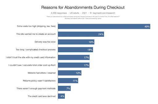
Excluding viewers who are just adding items to compare your prices with other competitors or determining the total cost of the product without any intent to buy, below are the main reasons why cart abandonment occur:
-
Extra costs are too high
After adding items to their cart, customers may get shocked that unexpected costs are added to the basic price of the product such as shipping, taxes or any other fees. If shipping cost is charged, you need to mention that upfront as well as any other required fees.
-
An obligation to create an account
Asking shoppers to create an account before being able to add items to cart breaks the purchase cycle which leads to viewers bouncing off the page, preventing them this way from proceeding to the checkout process.
Instead, creating an account should be optional and this can be done after purchase, either in the confirmation step after checkout, or somewhere on your site, asking them to provide their contact information in order to get constant email updates from your brand.
-
Slow delivery
Customers expect to get their ordered products on time and any delay would make them frustrated.
To be efficient with this, provide a variety of shipping options; this will allow customers to select their preferred delivery times. You can then choose among your delivery providers the one that suits the schedule of your customers the best.
-
Long and complicated checkout process
One of the most common reasons why customers left without completing their purchase orders is the complicated checkout process.
Simplicity is key, adding any additional step is like a roadblock that would force you to change your direction while driving.
To make sure you provide a good user experience, minimize steps like required data entry and show all details clearly in order to simplify the checkout process as much as you can.
-
Security concerns
If customers feel their personal information and credit card payments are not properly stored and secured, they will never take any step forward.
To make sure you’re following proper procedures, follow the PCI Compliance Guidelines. Furthermore, you can display on all pages asking for checkout, your ecommerce security credentials and trust badges so customers can trust that their information is being processed safely.
-
Total costs are not visible upfront
As mentioned earlier, customers would like to know the total price of the product they are going to buy before adding them to cart.
The earlier you show all costs upfront such as taxes and shipping fees the less likely your customers feel deceived or disappointed.
-
Website errors or sudden crashes
Encountering repetitive page errors or unexpected crashes would impact the customer’s experience and boost abandonment rate.
Although such issues might be out of control, you can monitor how your shopping cart and checkout page perform on all your browsers and devices, test loading time speed, downtime and responsiveness.
-
Unsatisfactory return policy
Customers should know about the return policy after adding their products to cart. Any ineffective return rules would make them look for another brand especially that they can find a lot of alternatives offering a smooth policy.
For instance, a good practice is to try a free 30-day return and see if it’s a suitable strategy for your business. The most important thing is to clearly inform your customers about your return policy at an early stage in order to make them comfortable before completing any order. Doing this smartly would help boost sales overtime.
-
Lack of payment methods
Limiting the payment options for customers would push them away. Therefore, offer them a variety of payment options using either paypal or credit card.
-
Card Rejected
It’s a really disappointing moment for customers when they face any payment issue after they spent time finding their preferred product and reached the last step. Although this problem comes mainly from the cardholder’s bank, you need to find a suitable alternative.
For example, you can offer them an option to try another card or payment method. Using ecommerce platforms like Shopify, you have the option to test the checkout process using fake credit card numbers.
Best practices for crafting cart abandonment email
-
Write a catchy subject line
The subject line intrigues 64% of people to open an email, according to cmb. The main thing in the subject line is to make it short, relevant, and personalized. You can use humor, urgency or scarcity but don’t exaggerate.
-
Start with an attention-grabbing headline
Starting the email with an interesting headline and sub-headline entices the viewer to continue reading through your email content. For example, you can start with a question that creates a sense of curiosity such as “Did you know what you missed?”.
-
Make a clear summary of cart content
Easily remind your customers about the product that they missed by positioning it in the center of your email. A good practice is to mention the product specifications such as description, quantity, size, price and shipping cost.
-
Use attention-grabbing imagery
People love visuals so the more you focus on showing related and high resolution images of the product that they missed out, the better the chance of converting.
-
Use a good call-to-action button
A clear call to action that tells the user to take the next step is required. You can use the first pronoun like “View my cart” or “Take me back to shopping cart” to highlight his ownership and boost his intent to buy. In addition, the button should be placed above the fold and used in a contrasting color that stands out from the rest of the email.
-
Don’t offer discounts too much
Although discounts are an incentive to drive customers to complete their purchases, make sure you determine the best time to do it; overdoing it would impact your profit margins and would give an impression to your customers that your product is underestimated.
-
Use customer reviews
Showing some reviews from your existing customers inside your email or redirecting your shoppers to your online reviews site’s page adds credibility to your brand and incentivizes more to buy your product.
-
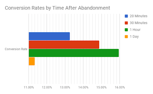
Determine the best time to send your email
There’s not any standardized rule for sending your abandoned cart email at a specific time but a good practice is to send at least after an hour from cart abandonment so you give your customers enough time to think before nudging them.
-
Use dynamic content
The great thing about dynamic elements is that the content is updated based on the individual. The visuals and information change according to the customer’s location. Examples of information are product popularity and stock levels. Using dynamic content is a great personalization technique that should never be ignored.
-
Personalization
Mentioning customers’ names in subject lines and email content show that the email is specifically tailored to their needs. However, personalization even goes beyond this, one of the creative tactics is to retarget shoppers with items tailored based on their previous purchases and browning history when cross-selling . As for upselling, you can showcase similar higher versions of items related to the abandoned item to entice customers to upgrade.
-
Test and improve
Always keep an eye on the analytics and see how emails are performing. Monitor engagement such as CTR rates and conversions. If results don’t go as expected, try checking what needs to be tweaked and act accordingly.
21 Cart Abandonment Emails
Find below 21 examples of cart abandonment emails that showcase the best practices that each ecommerce brand did as well as the areas for improvement that would have been taken into consideration:
1. LimeCrime
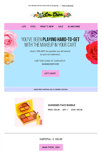
The good practices that this abandoned cart email follows:
- The different colors are compatible with each other and reflect their logo.
- The sentence on top clearly reminds the shopper what things he left.
- The discount in the sub-headline encourages the cart abandoner to go back and complete the checkout.
- The CTA button’s color stands out and saying “Let’s shop” stimulates their intent to buy.
- The coupon code eases the process for the shopper to take advantage of the offer.
- Showing a photo of the abandoned item is a good idea to remind the shopper about the product he left without leaving him guessing or wondering what he initially left in the first place.
- The price and cost are clearly listed to explain where the subtotal comes from.
- The fact that the shipping cost is free is an additional incentive not to keep shoppers hesitant to buy.
- Adding another CTA button below the total fee is a good idea and the fact that the sentence inside is different from the first one above the fold is a smart tactic.
- The areas for improvement that this abandoned cart email would have taken into consideration:
- The subject line “You already did the hard work of shopping” is good but it could have highlighted a sense of urgency.
- The second call to action includes an abbreviation that some customers may not understand. The clearer the call to action the better.
The areas for improvement that this abandoned cart email would have taken into consideration:
- The subject line “You already did the hard work of shopping” is good but it could have highlighted a sense of urgency.
- The second call to action includes an abbreviation that some customers may not understand. The clearer the call to action the better.
2. Away
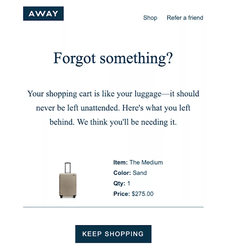
The good practices that this abandoned cart email follows:
- The question “Forgot something?” drives curiosity.
- The example resembling a shopping cart like a luggage drives the user not to miss what they initially started.
- The photo of the item with the details quickly reminds the customer what they abandoned.
- The product’s specifications are clearly presented next to the visual.
- The CTA button grabs customers’ attention.
The areas for improvement that this abandoned cart email would have taken into consideration:
- The CTA button has the same colors as the logo which made the logo above look like a button as well and not a logo. Using another compatible color for CTA would have been a better choice or rounding the buttons edges can be a suitable alternative.
3. Nomad
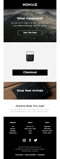
The good practices that this abandoned cart email follows:
- The subject line “Nomad gear is selling out quick” isn’t shown on top of this template but it creates a fear of missing out FOMO effect, which urges cart abandoners to take action.
- The email’s design grabs customers’ attention and perfectly goes with their branding.
- The copy is personalized, it clearly restates the problem and then shows the shopper that the solution is still there by rechecking what was left in the cart.
- The call to action buttons are focused around the same purpose and they stand out in the template.
- The part “Afraid to make the leap?” and the sentence that follows shows clarity and comforts the reader that they have a 30-day period to return or exchange the product and 2-year warranty.
The areas for improvement that this abandoned cart email would have taken into consideration:
- Showing additional product details aside the image such as the item’s name, specifications and price would clearly and quickly remind the viewer about the product while they are checking the email, although we believe some brands may do this on purpose to drive curiosity and push their shoppers to go back to cart.
4. Beardbrand
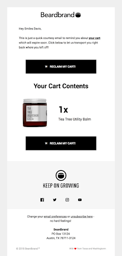
The good practices that this abandoned cart email follows:
- The template’s design is compatible with their branding.
- The email shows that the copy is relevant to the shopper.
- The copy creates a sense of urgency that the product will expire soon and this entices cart abandoners to take action.
- The abandoned product’s visuals are high resolution and appealing.
- The first pronoun “my cart” stimulates the customer’s intent and involves them by speaking from their perspective.
- The slogan “Keep On Growing” is catchy and encourages the viewer to check their social media channels and follow them.
- The 2 options to either update their preferences or unsubscribe at the email’s footer as well as the word “no hard feelings!” comfort the recipient and show full transparency from the brand’s side.
The areas for improvement that this abandoned cart email would have taken into consideration:
- It would have been better if the 2 CTA buttons were more distant from each other since adding multiple CTAs is useful when there will be a long copy or several sections in one template.
5. Birchbox
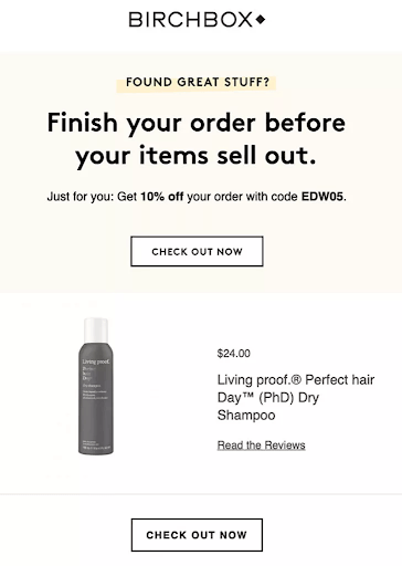
The good practices that this abandoned cart email follows:
- The copy’s font color matches their logo.
- The question “FOUND GREAT STUFF?” highlighted in yellow makes it stand out from the rest of the copy and drives curiosity even if it’s in a smaller font size.
- The sentence on the top emphasizes on urgency which induces shoppers to take action right away.
- Offering a discount is an additional incentive to click.
- The CTA buttons include “Now” telling shoppers NOT to postpone.
- Asking customers to read reviews highlights trust and credibility.
The areas for improvement that this abandoned cart email would have taken into consideration:
- Asking shoppers to read other reviews and offering discounts at the same time would diminish the value of the product and leave customers wondering to what extent the product is effective and authentic as long as you’re offering a discount right away. A good practice is to see how reviews work and if conversion rate is not as expected, you can decide to offer discounts at a later stage.
6. Lush
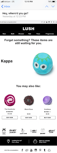
The good practices that this abandoned cart email follows:
- The “Hey” in the subject line gives a nudge.
- The items are visually well appealing.
- The idea of offering related items works well in this case because the price of such products is affordable. If you’re offering free shipping, showcasing additional products should be an additional stimulant.
- Showing the price of related products may entice customers to add them to their carts.
- The way the specifications are listed with their icons below the related items show full clarity and encourage shoppers to move forward.
The areas for improvement that this abandoned cart email would have taken into consideration:
- The subject line “Hey, where’d you go?” can be a bit tricky and if you’re sending this email a few hours or day after abandonment, customers may not easily recall what this email is about. Being clearer by including a sense of urgency, curiosity, or emoji adds some traction.
- The main item’s price should have been listed to be consistent with the way the related items are shown below. Also it should have a CTA button.
7. Casper
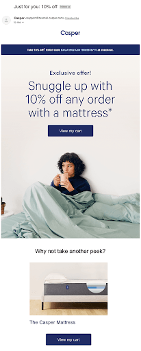
The good practices that this abandoned cart email follows:
- The subject line shows that this offer is specifically customized for the user and the 10% off is an incentive that drives open rates.
- The way the offer is presented in the dark blue background section on top of the email makes it clear and visible in front of viewers.
- The term “Exclusive Offer” complements what has been already stated in the subject line and keeps telling customers that the brand is keen to deliver on their promise.
- The background image is appealing.
- The first pronoun in the call to action button “View my cart” stimulates the customer’s intent to take action since it speaks from their perspective and highlights their belongings. Also the button stands out in the template.
- Asking shoppers to take another look and showing the mattress via an image grabs their attention and stimulates them to go back to their cart.
The areas for improvement that this abandoned cart email would have taken into consideration:
- It would be a better idea to show the product with their specifications to remind the user immediately about the abandoned item but each brand has its way of crafting their emails.
- Although offering discounts is an incentive that would push shoppers to go back and complete their purchase order, it’s more preferable to keep this as a last option, especially if you’re offering a valuable product.
8. Quip
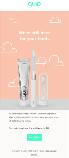
The good practices that this abandoned cart email follows:
- The design is simple and the colors used are comfortable to the viewer’s eye.
- The sentence on top guarantees for customers that they can still get what they left and the copy below the imagery confirms the aforementioned.
- The CTA button’s color is the same as the logo’s color and stands out in the email.
- The idea of offering the first refill for free incentivizes customers to click and proceed.
- Using social proof adds credibility.
The areas for improvement that this abandoned cart email would have taken into consideration:
- Nothing critical, but it’s always essential to check if the types of promotions would badly interfere with reviews and minimize the value of the product. In the case above, first-time promotion to get customers to try the product works better than discounts.
9. Brooklinen
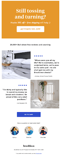
The good practices that this abandoned cart email follows:
- The orange color on top adds dynamism to the template.
- The question “Still tossing and turning?” sounds that there’s a solution to the confusion customers might be facing.
- The 10% off is an incentive to push them to buy.
- Showing reviews is a great sign that the product is successful and the number “28000+” shows that a huge amount of their clients trust them which boosts cart abandoners trust.
- The way the images are shown aside social proof and stars adds more value and diversity to the email.
- The second CTA button is different from the first “Activate 10%” which is also a creative practice, avoiding redundancy.
- The idea of providing support and the way the 3 images are displayed add beauty to design.
Using social proof adds credibility.
The areas for improvement that this abandoned cart email would have taken into consideration:
- As mentioned earlier in analyzing previous cart abandonment emails, it’s critical to be aware when considering offering discounts with social proof, since clients would wonder why there’s a discount on the product as long as the reviews are positive.
10. Whisky Loot
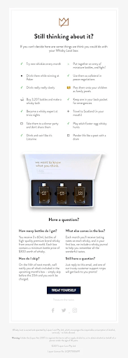
The good practices that this abandoned cart email follows:
- The title on top “Still thinking about it?” is a good teaser to remove the doubt and push the shopper to take action.
- The email is supported with tips that would help remove any hesitation that would keep them from buying what they initially selected before abandonment.
- The way these tips are listed and their icons add spark to the design and make the email more enticing to read.
- The image showing the 3 bottles in a box makes the template visually appealing and so does the writing over the cover.
- The Q and A provides transparency and removes any additional doubt and asking viewers to reply in case they have any questions is a good way of providing support.
- The CTA button “Treat Yourself” is creative and drives users to click.
The areas for improvement that this abandoned cart email would have taken into consideration:
- The CTA button could have been placed underneath the image instead of leaving it till the end.
- Adding another CTA especially for mobile is good for the user experience because these 2 columns will be converted into a list-view and requires more scrolling.
11. Dyson
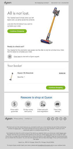
The good practices that this abandoned cart email follows:
- Other than using it as a reminder, the headline “All is not lost” comforts the user that he hasn’t lost anything yet and to continue from where he left.
- The CTA button’s color grabs customers’ attention and is compatible with the logo.
- Representing a visual of the product is always a great way to quickly remind the shoppers about the abandoned item.
- The idea of offering an option for chatting with an expert shows how much the company cares about providing their customers full assistance.
- Re-showing the product item along with its quantity and price is a smart idea of differentiating it from the way it was shown in the previous section.
- The CTA button is placed again under the second block and diversifying it on the left then on the right makes it persistent enough to drive users to click.
- Stating the reasons to shop from their brand is an additional incentive that would encourage shoppers to complete their order especially because these incentives include free tools and service and guarantees that there’s a refund policy. Also the icons used are relevant.
- The link to privacy policy and the copy below clarifies the rules of the company which boosts transparency.
The areas for improvement that this abandoned cart email would have taken into consideration:
- Although this is not a serious issue here since it was highlighted in the footer, avoiding using too much copy especially in the email content would make it look more enticing to read.
12. Ugmonk
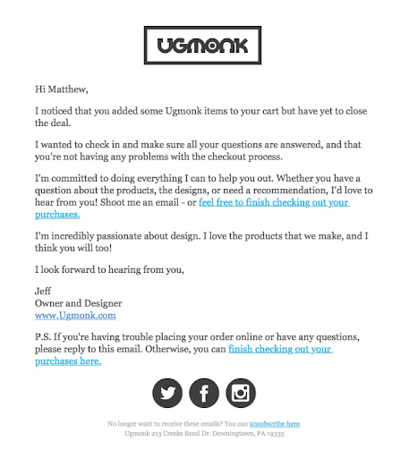
The good practices that this abandoned cart email follows:
- The email is written as a plain text and it’s a great personalization technique.
- The copy is clear and straight-forward; it shows that the company cares by making sure no problems with checkout and offers an option to reply for any questions, not only asking the customer to go back to their cart.
- The email is well personalized, especially that it starts addressing the customer by his name.
- The email is being sent from the owner and this makes the customer feel more appreciated.
The areas for improvement that this abandoned cart email would have taken into consideration:
- No critical suggestions for improvement, but it would be good to specify what was left in the customer’s cart.
13. Dote
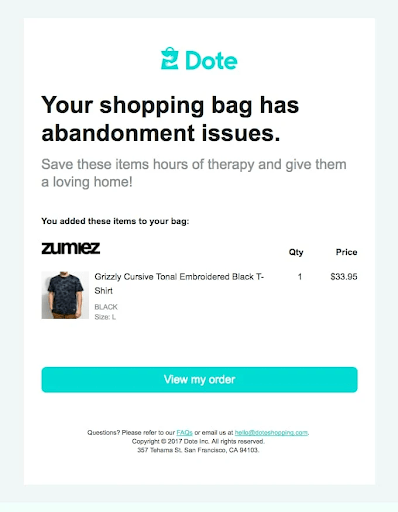
The good practices that this abandoned cart email follows:
- The design is simple, colors are compatible and comfortable to the eye.
- Due to the simplicity of design, the content is very easy to read.
- The product’s image along with the quantity and price are well presented.
- The first pronoun in the CTA button talks from the perspective of customers and this would drive them to click and move forward with order completion. Also using the same color as their logo’s color makes it clearly visible and sparking the design which grabs their attention.
- Providing an option to check their FAQs and email the company for any further questions or assistance eases the process even more. Customers may always want to seek assistance or look for specific information.
The areas for improvement that this abandoned cart email would have taken into consideration:
- The CTA in bold on top might be scary the first moment when shoppers read it although it would urge them to click and fix the issue. It would be better to use urgency while trying to avoid using negativity at some point.
14. 23andMe
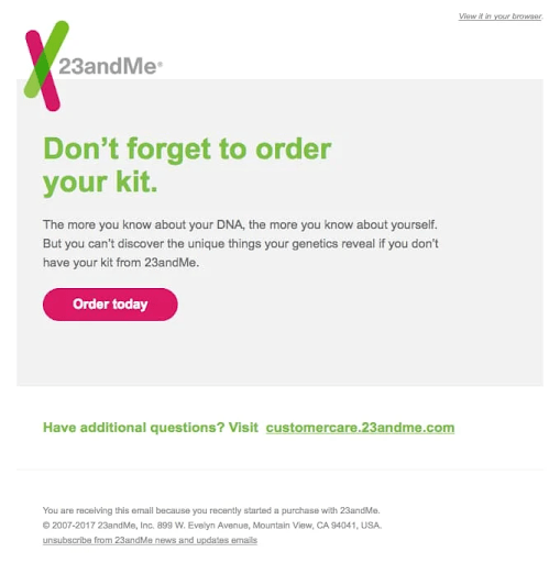
The good practices that this abandoned cart email follows:
- The 3 colors used in this template match exactly the same 3 colors used in their logo which shows consistency and creativity in design.
- The email is simple and short which makes it easier for people to digest the content.
- The copy below the headline in green is straightforward and entices shoppers to click to continue from where they left.
- The CTA button “Order today” urges people to act right away, leaving NO potential for them to bounce off.
- Providing support in case they have any questions is a good point to show that the company really cares about fulfilling their customers’ concerns.
The areas for improvement that this abandoned cart email would have taken into consideration:
- This email would have shown the product’s visual and specifications since clarifying all points within the email might fully convince customers and get them ready to take the next step.
15. Google Store
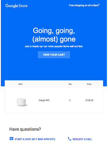
The good practices that this abandoned cart email follows:
- The blue and white represents authenticity and reliability and the design is comfortable to the eye.
- The top sentence on the right side says “Free shipping on all orders” incentivizes customers to buy.
- The headline and sub-headline on top highlights the urgency which drives customers to act fast.
- The product is revealed in a clear and interesting manner especially with how the white block intervenes with the previous blue background block.
- Providing support shows their care toward their customers. What they also did well in this template is offering both a live chat and an option to request a call.
- Showing the date and time of their availability is creative, showing full clarity and removing any doubt.
The areas for improvement that this abandoned cart email would have taken into consideration:
- The CTA button above the fold can be used in a more contrasting color.
- Adding some customer reviews would have been advisable because customers love to rely on other people’s feedback when choosing electronics and computer equipment.
16. Vans
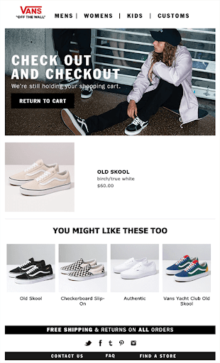
The good practices that this abandoned cart email follows:
- The headline “Check out and Checkout” is creative and catchy.
- The idea of offering related products is a great option for upselling especially that the upsell phase most of the time is suitable before checkout.
- The images are visually appealing.
- The Free Shipping and returns comfort the customer that no additional charges are required and that all orders can be returned.
- The options to get access to FAQs and contact the team are additional benefits for customers.
The areas for improvement that this abandoned cart email would have taken into consideration:
- The sub-headline “We’re still holding your cart” is good but can be elaborated to act on urgency or something stronger needed to be there.
- The sub-headline font color is very light compared to the headline which makes it not visible enough. It would be better to either bold it, use it in a bigger font size or in another compatible color.
- The call to action button “Return To Cart” should have been used in other colors since the black and white don’t contrast with the design of the template.
- Adding a second call to action right below the abandoned item would have been a good practice.
17. The Mountain
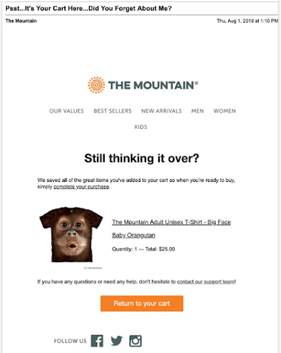
The good practices that this abandoned cart email follows:
- The humor in the subject line may boost open rates.
- The headline “Still thinking it over?” would remove any suspicion.
- The sub-headline shows how easy the process is by using the adverb “simply”.
- The visual presentation of the product is attention-grabbing.
- The call to action button’s color is contrasting which makes it easily recognizable.
- The option to contact their support team is a great service addition.
The areas for improvement that this abandoned cart email would have taken into consideration:
- Nothing critical but the blank space on top can be reduced and the social icons can be even more distant from the CTA button.
18. Virgin Atlantic
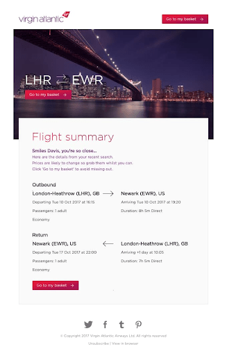
The good practices that this abandoned cart email follows:
- The template’s design is attention-grabbing and easy to read through.
- The colors used reflect the company’s branding and the purple in the imagery and the CTA button are undoubtedly compatible with the copy.
- The copy under flight summary eases the process that the customer is very close to finalizing the process; the second sentence in the sub-headline “Prices are likely to change” shows transparency and the last sentence is to trigger them to act fast before anything occurs later on.
- The call to action button is catchy and uses the first pronoun which addresses the customer’s perspective. In addition, the arrow intrigues people to click to discover what’s next.
- Both CTA buttons are scattered properly; one on the top right so it will be recognizable in the beginning and another on the left after rechecking the details of the flight so no more information is missing at this point.
The areas for improvement that this abandoned cart email would have taken into consideration:
- Mainly no persistent issues in this template that need improvement. A good practice is to always A/B test how email looks on mobile, especially when having multiple columns or a variety of elements, tables, sections, etc…
19. Cufflinks
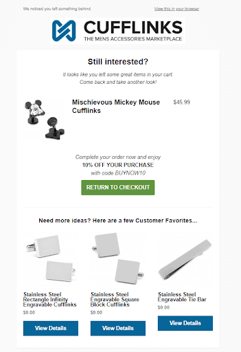
The good practices that this abandoned cart email follows:
- The design is simple and the colors used are compatible and comfortable to the eye.
- The structure of the email makes it easy for readers to read through the content.
- The copy above the CTA button in green shows urgency with a 10% off incentive and coupon code to complete the process and take advantage of the promotion. This is a good way to drive customers to convert. Also the discount percentage is highlighted in bold to help people easily recognize it.
- The CTA button in the middle grabs customers’ attention.
- Including more ideas is an additional stimulant that would persuade customers to act and so the sentence which says that these additional items are customer favorites.
- The 3 CTA buttons “View Details” are used in a different color than the main button to focus on the major goal to return to checkout and the blue color goes with their logo on top and is compatible with the black copy and green button in the middle.
The areas for improvement that this abandoned cart email would have taken into consideration:
- The subject line is not bad but it can even be more intriguing.
- There could be more spacing between the logo on top and the copy and so the spacing between the green button and the sentence underneath it.
- The alignment between the 3 ideas must have been fixed.
20. Drop
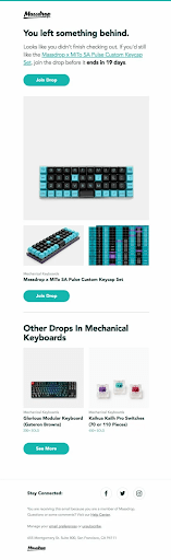
The good practices that this abandoned cart email follows:
- The design and colors variety made the template look appealing.
- The fact that this offer ends in 19 days may urge people to act fast just in case they miss the offer.
- The 3 CTA buttons color is great and compatible with their logo and copy.
- Showcasing more items is a great upselling tactic at this point.
- Offering further assistance through their help center is a great point to address any potential client’s concern.
The areas for improvement that this abandoned cart email would have taken into consideration:
- No serious areas for enhancements but the spacing after the first CTA button can be reduced. It’s critical not to compress the content while not leaving large areas blank.
21. Jack Wills
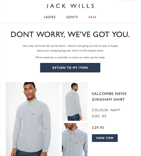
The good practices that this abandoned cart email follows:
- The design is consistent with their branding.
- The headline on top means that a simple solution has been brought to customers.
- The sub-headline calls the shopper by his name which is a great personalization strategy and that the email specifically addresses their needs.
- The sub-headline empathises what the customer may be encountering then provides a solution accordingly.
- The first pronoun in the call-to-action button “Return To My Items” speaks from the customer’s perspective and addresses his intent. Also the blue dark background makes it stand out in the template.
- The shirt is visually appealing especially that they showed it in from both sides and zoomed in to clearly show the customer how it looks.
- The product and its specifications are clearly listed on the right with another CTA button.
The areas for improvement that this abandoned cart email would have taken into consideration:
- No areas needing enhancements have been detected; generally, test how your emails look like on all devices and browsers before sending them out.
In summary, crafting successful abandoned cart emails is not rocket science. Always put yourself in your customers shoes and think how they are going to react when reading your email and if what you include adds value and convinces them enough to take action.
Be always consistent in your branding, use catchy subject lines, emphasize on personalization, provide persuasive copy, focus on simplicity in design, show appealing visuals, reviews from existing customers, use attention-grabbing call to action buttons and offer an option for live chat or call to seek further assistance…
It’s also critical to remember that what applies for other businesses doesn’t necessarily mean it should apply to yours and that’s why you need to always monitor your abandoned cart emails performance and take required actions to tweak what hasn’t worked well in the first place.
The 21 examples above will help you get inspired and find out what practices you can implement for your business and what things you can even do better. Hope you found it helpful.
Don’t forget to share this article